
Mở App để xem thêm ảnh
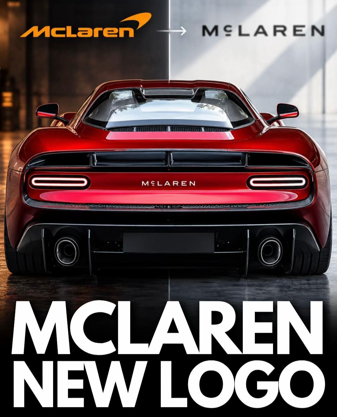
😳 McLaren has officially unveiled a completely new logo that will define the brand across its next generation of road cars and racing programs. The familiar italicized McLaren lettering is being replaced by a wider, cleaner design built around a new bespoke typeface called McLaren Sans. The unusual styling of the “Mc” actually traces back to the sign above the McLaren family service station in Auckland, New Zealand, owned by Bruce McLaren’s parents. That same workshop is where Bruce worked on the modified Austin Seven that would take him to his first racing victory, giving the minimalist new design a deeper connection to McLaren history than it initially appears. The famous McLaren Speedmark isn’t disappearing either, but the new wordmark will become the dominant part of the company’s visual identity going forward. Papaya will also remain a major part of McLaren, particularly in motorsport, while Automotive is adopting a darker and more premium visual direction. The redesigned branding will eventually appear
#info_news
#McLaren
#logo redesign
#branding
#McLaren Sans
#McLaren 6GT
Thích
Bình luận
Lưu